1-800-913-2350
Call us at
1-800-913-2350
GO
icon-hamburger
REGISTER
LOGIN
SAVED
CART
HOME
SEARCH
Styles
Barndominium
Bungalow
Cabin
Contemporary
Cottage
Country
Craftsman
Farmhouse
Modern
Modern Farmhouse
Ranch
See All Styles
Sizes
1 Bedroom
2 Bedroom
3 Bedroom
4 Bedroom
Duplex
Garage
Mansion
Small
1 Story
2 Story
Tiny
See All Sizes
Our Favorites
Affordable
Basement
Best-Selling
Builder Plans
Eco Friendly
Family
Mid Century Modern
Open Floor Plans
Simple
Walkout Basement
Wraparound Porches
See All Our Favorites
Regional
Alabama
California
Cape Cod
Florida
Georgia
North Carolina
South Carolina
Tennessee
Texas
Virginia
See All Regional
SALE
BLOG
4 Bedroom House Plans
Architecture & Design
Barndominium Plans
Cost to Build a House & Building Basics
Floor Plans
Garage Plans
Modern Farmhouse Plans
Modern House Plans
Open Floor Plans
Small House Plans
See All Blogs
REGISTER
LOGIN
SAVED
CART
GO
GO
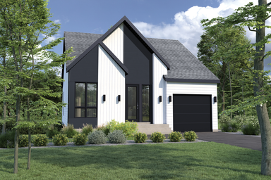
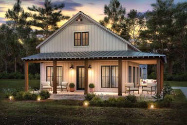
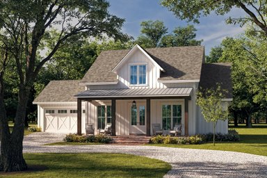
1 Bedroom Barndominium Floor Plans
You'll love these 1 bedroom barndominium floor plans.
Recent Articles
Page
1 of 82
Small Modern House Plans Under 1,500 Sq. Ft.
Live efficiently with these small modern house plans under 1,500 sq. ft.
How Much Does It Cost to Build a House?
Discover what goes into home building costs.
How Big is 1,300 Square Feet?
How big is 1,300 square feet? Find out with these house plans.
Single Story Garage Living Quarters
Add value to your property with these smart plans.
What's the Best Layout for a 1,000 Sq. Ft. House?
Explore some of our favorite small house plans.
1,200 Sq. Ft. Barndominium Floor Plans
Stay organized with these 1,200 sq. ft. barndominium floor plans.
A-Frame Tiny House Plans
Enjoy relaxed living with these A-frame tiny house plans.
U-Shaped House Plans
Maximize outdoor living with these U-shaped house plans.
How Big is 1,500 Square Feet? Check Out These House Plans!
Learn how big 1,500 square feet really is with these plans.
Page
1 of 82
All Article Tags
2 Story House Plans
3 Bedroom House Plans
4 Bedroom House Plans
Architecture & Design
Barndominium Plans
Blogs We Read
Cabin Plans
Cost To Build A House And Building Basics
Cottage House Plans
Craftsman House Plans
Curb Appeal
Duplex House Plans
Energy Efficiency
Family Home Plans
Farmhouse Plans
Floor Plans
Garage Plans And Garage Apartment Plans
House Designers
House Styles
Just for Fun
Kitchen, Bath & More
Large House Plans
Luxury House Plans
Mansion Floor Plans
Modern Farmhouse Plans
Modern House Plans
Most Popular
Multigenerational Design
Narrow Lot House Plans
Open Floor Plans
Outdoor Living
Product & Finishes
Ranch House Plans
Real Building Stories
Simple House Plans
Small House Plans
Texas
Tiny House Plans
Vacation House Plans